


Description
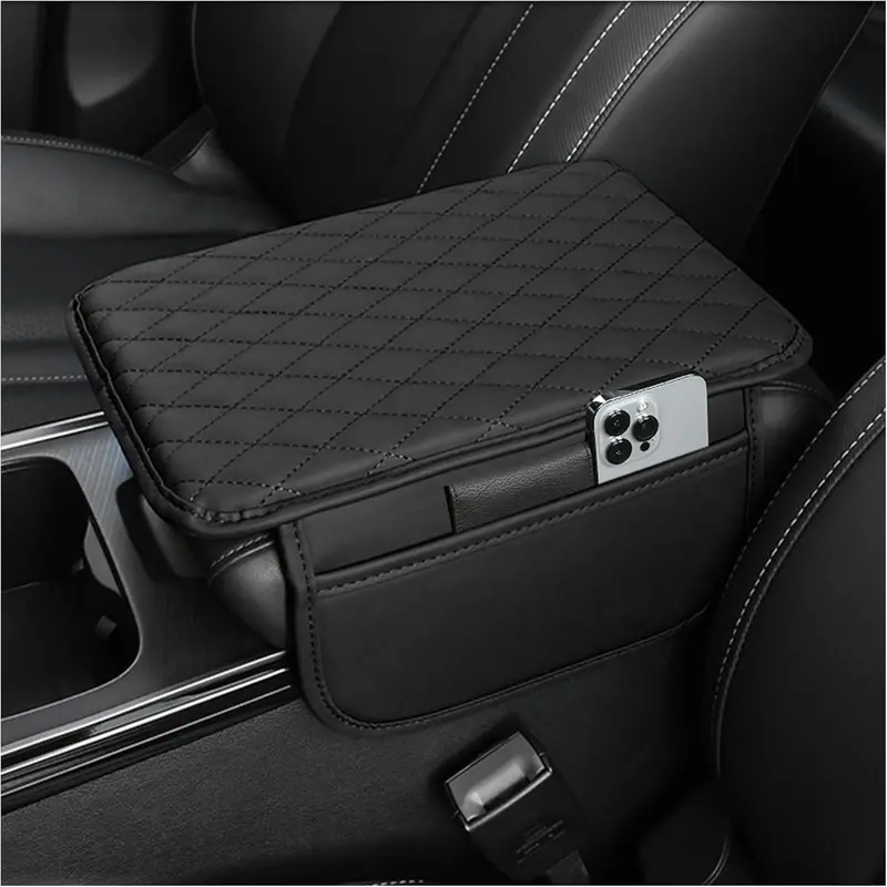
- 🔰 UPGRADED SIDE STORAGE DESIGN – Our product dimensions are; 12.13 x 7.8 inches, please be sure to measure your armrest box to see if it fits before purchasing!There is an 8.66*5.12 inch storage pocket design on each left and right side, expanding the storage space, convenient and practical. Meet the storage needs of the main passenger seat, you can store your cell phone, keys, tissues, ID and some other small daily items.
- 🔰 PREMIUM MICROFIBER LEATHER MATERIAL – This car center console cover is made of quality microfiber leather material, soft and skin-friendly touch. Exquisite and fashionable diamond shaped stitching, every detail is in place. Inside the car center console cover is made of thickened memory foam, even after squeezing, it can slowly recover to its original shape.
- 🔰 RELIEVE DRIVING FATIGUE – The arm rest cover for car adopts ergonomic design, giving just the right amount of arm support, effectively dispersing elbow pressure and relieving driving fatigue. Protect your car’s center console from getting dirty or scratched. Especially suitable for long time driving or long distance traveling, bringing you a new experience of relaxation and comfort!
- 🔰 NON-DESTRUCTIVE INSTALLATION – This car console cover is designed with an elastic band for a firm fit and not easy to shake. And the back side is full of protruding dots, which can effectively avoid the armrest cover from slipping and shifting. All you need to do is to open the center console cover, put the elastic band directly into the cover and then close it.
- 🔰 BUYER’S GUIDE – You will receive a car armrest storage box with the size of 12.13*7.80 inch, please measure the size of your car’s armrest storage box before you buy. We have prepared five simple and beautiful colors for you, you can choose according to your own preferences.
/* * Used when device = desktop * Configured in: configuration/brazil-config/global/brand-story.cfg */ /* Because the carousel is implemented as an ol list, any lists in the card text will have a secondary list style (letters). This will give an incorrect appearance to viewers, so we set all lists to the primary list style (numbers). */ .aplus-brand-story-card ol li { list-style: decimal; } /* Top level containers */ .aplus-module .apm-brand-story-hero { -moz-box-sizing: border-box; -webkit-box-sizing: border-box; box-sizing: border-box; width: 1464px; height: 625px; background-color: #fff; } .aplus-module .apm-brand-story-card { -moz-box-sizing: border-box; -webkit-box-sizing: border-box; box-sizing: border-box; width: 362px; height: 453px; background-color: #fff; } .apm-brand-story-hero, .apm-brand-story-card { -moz-box-sizing: border-box; -webkit-box-sizing: border-box; box-sizing: border-box; position: relative; width: 100%; height: 100%; float: none; } .aplus-module.brand-story-card-1-four-asin .apm-brand-story-card { /* Only 12px to account for image cell border */ padding: 12px; } /* Full background image (Hero 1 & Card 2) */ .aplus-module .apm-brand-story-background-image { -moz-box-sizing: border-box; -webkit-box-sizing: border-box; box-sizing: border-box; overflow: hidden; position: absolute; width: 100%; height: 100%; } /* Card 1 small images */ .aplus-module .apm-brand-story-image-grid { -moz-box-sizing: border-box; -webkit-box-sizing: border-box; box-sizing: border-box; padding: 0px; margin: auto; display: flex; flex-flow: row wrap; } .aplus-module .apm-brand-story-image-grid .apm-brand-story-image-grid-item { /* Use content-box to ensure image size matches editor schema */ -moz-box-sizing: content-box; -webkit-box-sizing: content-box; box-sizing: content-box; padding: 0px; margin: 2px; width: 162px; height: 185px; border: 1px solid #fff; } .aplus-module .apm-brand-story-image-grid .apm-brand-story-image-grid-item .apm-brand-story-image-link { display: block; width: 100%; height: 100%; padding: 2px; } .aplus-module .apm-brand-story-image-grid .apm-brand-story-image-grid-item .apm-brand-story-image-link .apm-brand-story-image-img { display: block; width: 100%; height: 100%; object-fit: cover; } /* Card 3 logo image */ .aplus-module .apm-brand-story-logo-image { -moz-box-sizing: content-box; -webkit-box-sizing: content-box; box-sizing: content-box; height: 145px; margin: 0px 4px; padding: 20px; padding-bottom: 0px; } /* Text overlays */ .aplus-module .apm-brand-story-text-bottom { -moz-box-sizing: border-box; -webkit-box-sizing: border-box; box-sizing: border-box; position: absolute; bottom: 13px; left: 13px; } .aplus-module .apm-brand-story-hero .apm-brand-story-text-bottom { background-color: rgba(0,0,0,0.6); color: #fff; padding: 13px 65px 13px 13px; /* accounts for overlap of first card */ width: 437px; } .aplus-module.brand-story-card-2-media-asset .apm-brand-story-text-bottom { background-color: rgba(255,255,255,0.6); color: #000; padding: 13px; width: 336px; } .aplus-module.brand-story-card-1-four-asin .apm-brand-story-text { margin-top: 8px; padding-left: 2px; padding-right: 2px; } .aplus-module.brand-story-card-1-four-asin .apm-brand-story-text.apm-brand-story-text-single { margin-top: 20px; } .aplus-module.brand-story-card-1-four-asin .apm-brand-story-text h3 { white-space: nowrap; overflow: hidden; text-overflow: ellipsis; } .aplus-module .apm-brand-story-slogan-text { -moz-box-sizing: content-box; -webkit-box-sizing: content-box; box-sizing: content-box; margin: 0px 4px; padding: 20px; } .aplus-module .apm-brand-story-faq { -moz-box-sizing: content-box; -webkit-box-sizing: content-box; box-sizing: content-box; padding-top: 10px; } .aplus-module .apm-brand-story-faq-block { margin: 0px 10px; padding: 10px; } .aplus-v2 .apm-brand-story-carousel-container { position: relative; } .aplus-v2 .apm-brand-story-carousel-hero-container, .aplus-v2 .apm-brand-story-carousel-hero-container > div { position: absolute; width: 100%; } /* Ensuring the carousel takes only the space it needs. The sizes need to be set again on the absolutely positioned elements so they can take up space. */ .aplus-v2 .apm-brand-story-carousel-container, .aplus-v2 .apm-brand-story-carousel-hero-container { height: 625px; width: 100%; max-width: 1464px; margin-left: auto; margin-right: auto; overflow: hidden; } .aplus-v2 .apm-brand-story-carousel-hero-container, .aplus-v2 .apm-brand-story-carousel-hero-container > div { height: 625px; } .aplus-v2 .apm-brand-story-carousel.a-carousel-container { padding: 0px; } /* This centers the carousel vertically on top of the hero image container and after the logo area (125px). Margin-top = (heroHeight – cardHeight – logoAreaHeight) / 2 + logoAreaHeight */ .aplus-v2 .apm-brand-story-carousel .a-carousel-row-inner { margin-top: 149px; } /* Cards need to have a width set, otherwise they default to 50px or so. All cards must have the same width. The carousel will resize itself so all cards take the width of the largest card. The left margin is for leaving a space between each card. */ .aplus-v2 .apm-brand-story-carousel .a-carousel-card { width: 362px; margin-left: 30px !important; } /* styling the navigation buttons so they are taller, flush with the sides, and have a clean white background */ .aplus-v2 .apm-brand-story-carousel .a-carousel-col.a-carousel-left, .aplus-v2 .apm-brand-story-carousel .a-carousel-col.a-carousel-right { padding: 0px; } .aplus-v2 .apm-brand-story-carousel .a-carousel-col.a-carousel-left .a-button-image, .aplus-v2 .apm-brand-story-carousel .a-carousel-col.a-carousel-right .a-button-image { border: none; margin: 0px; } .aplus-v2 .apm-brand-story-carousel .a-carousel-col.a-carousel-left .a-button-image .a-button-inner, .aplus-v2 .apm-brand-story-carousel .a-carousel-col.a-carousel-right .a-button-image .a-button-inner { background: #fff; padding: 20px 6px; } .aplus-v2 .apm-brand-story-carousel .a-carousel-col.a-carousel-left .a-button-image .a-button-inner { border-radius: 0px 4px 4px 0px; } .aplus-v2 .apm-brand-story-carousel .a-carousel-col.a-carousel-right .a-button-image .a-button-inner { border-radius: 4px 0px 0px 4px; }  Previous page
-


Stacool is committed to creating high-end products and a comfortable buying experience for you. Whether you’re looking for a flashy body makeover or to replace annoying and worn out car parts, we’re sure we have what you need.
Stacool wants you to always have a life full of light. Take your loved ones/friends and ride on the road to happiness.
-


Car Center Console Cover
-


![1PC Rear Car Windshield Sun Shade + 4PCS Car Window Shade for Baby,[Summer Essentials] Car Sun Sh...](https://m.media-amazon.com/images/I/41FqFhXaVKL.__AC_SR166,182___.jpg)
![Foldable Rear Car Windshield Sun Shade,[Summer Essentials] Sunburn Protection & Cooling Rear Suns...](https://m.media-amazon.com/images/I/41zf0hXcMWL.__AC_SR166,182___.jpg)
Car Window Shades
-


Car Windshield Sun Shade
-


Automotive Weather Stripping
-


Car Cup Holder Insert
-


Gear Shift Knob Cover
-


Automotive Interior Products
-
![2PCS Car Seat Gap Filler with Phone Holder,[New Upgrade] Multi-Function Car Side Seat Gap Filler ...](https://m.media-amazon.com/images/I/512ni6b0uaL.__AC_SR166,182___.jpg)
![2PCS Car Seat Gap Filler with Phone Holder,[New Upgrade] Multi-Function Car Side Seat Gap Filler ...](https://m.media-amazon.com/images/I/516chfUG3gL.__AC_SR166,182___.jpg)


Car Seat Gap Fillers
-


Auto Tools
-


Auto Tools
-


Auto Parts
-


Auto Tools
-


Auto Tools
-


Motorcycle Tools
-


Automobile Accessories
-


Wire Accessories
-


Automotive Exterior Trim
-


Motorcycle Accessories
Next page
Explore more from our collection.
Reviews
There are no reviews yet.